Prime (progressive/responsive image enabler) is a JavaScript script (still in development) I wrote, that allows for progressive and responsive image loading.
This means that initially a small, low quality image is loaded on the page, and this is then replaced (after load) by a higher quality version, but only if required (if the element is actually in view of the user). That’s the ‘progressive’ part. If the user scrolls, rotates or resizes the page, this process is repeated for all visible elements, either adjusting them up or down. This is the ‘responsive’ part.
Prime is an evolution of prImages and it was written with cimage in mind as an image-generating backend, but can easily be adapted to either pre-rendered images, or another resizing/thumbnail library.
Prime’s image fitting works by matching the actual dimensions of an element upwards to common responsive width breakpoints (160, 320, 480, 768, 1024, 1224, 1824, 1920 pixels, so a width of 600px would be matched to 768px, and so forth) as opposed to what width would be available. This prevents a plethora of image sizes to be generated, by effectively limiting them to 8 versions per image (9 if you include the original). Pixel ratio of the browsing device is also taken into account; image sizes are doubled when pixelratio is higher than 1.

Advantages
-
Speed
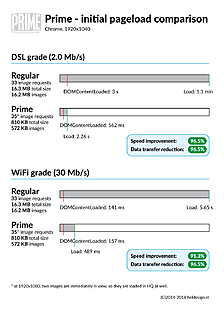
As an example (based on a desktop browser, at 1920×1080); If all images on this page would be loaded in the old-fashioned, regular way, the page would consist of 16.3 MB worth of html and 33 (high-quality, 16.2 MB) images, taking at around 1.1 minute(!) to fully load on a 2.0MB/s connection, or 5.65 seconds on a 30MB/s connection.
With Prime, that page now weighs in at a total of 810 KB, including 33 (low-quality) images, of which only 2 are loaded in HQ immediately (the top logo and the first image, which is in view), making a total of 35 images, taking up 572 KB. To fully load the page, this takes on average around 2.26 seconds on a 2.0MB/s connection, or 489 ms on a 30MB/s connection.
This means the pageload, without any user interaction, is 96.5% smaller and around 91.3% to 96.5% faster, depending on connection type (!).
Furthermore, if the user does not scroll the page, they never require the remaining 15.7 MB, potentially saving heaps of bandwidth on a busy website.
Even after scrolling through the whole page, data transfer is still only 8.2 MB (8,0 MB images) as opposed to 16.3 MB, because of better image fitting (see below), saving a total of 51% on data transferred.
-
Reduced content-shift
When a webpage loads, it displays as soon as text and css are loaded, and requested for all other resources are made. This means that a page will show without waiting for images to finish loading. This produces (if no dimensions were set on the
<img>elements) content-shift, which can be highly annoying.The progressive aspect of Prime enables you to initially set small, low quality placeholders while we wait for Prime to finish loading the high quality images. As these placeholders are (a lot) smaller than their HQ counterparts, they load much, much faster as well, limiting content-shift to an absolute minimum.
That said, I would still recommend taking other precautions, such as setting intrinsic ratio for all images.
-
Better image fitting
With responsive websites, the width of container elements varies a great deal, depending on the user’s resolution. To determine the best size image to load, we need to resort to JavaScript, as most serverside scripts really have no idea what resolution the user is in. This means that, on responsive websites, there is really no easy way to specify the best possible images to load in your HTML.
Prime circumvents this by checking the container size, and matching that to its breakpoints, producing an image that fits the current resolution/dimensions, without loading the highest quality image, per se. Say an element is 460px wide in the current user’s viewport, and the original image is 1024px wide, Prime will match that 460px to its breakpoints, resulting in a width of 480px, and then lets the browser load this image. This produces an image that weighs less than the original and looks perfect.
Ofcourse, if you set a fixed size for the image element, Prime will not exceed that limit.
Demo
This gallery is a demonstration of prime, with both div and img elements and debug-info on changes and dimensions. Resize, scroll and reload the page to see it in action.
Features
Prime’s main features and advantages are:
- Progressive – low quality images load by default, prime preloads (‘lazy’ loads) HQ variants in background only if needed (eg images are ‘in view’ for the user) and replaces low quality images when done
- Responsive – on each
resize,scrollororientationchangeevent, prime checks if images have changed in size (and require a larger or smaller image), preloads and replaces if needed - Smooth – allows for use of a ‘phantom’ image, which is an overlay image that is invisible on page load, and fades in the HQ version once loaded (Google image search uses this technique)
- Fire and forget – prime instantiates itself on script load, enumerates and sets up images as soon as the document is done drawing and handles all future events
- Pure JavaScript – requires no library/framework (like jQuery, etc)
- Can be loaded
asynchronously - Small (just 9.4KB minified)
Download
View/for the script at Github: https://gist.github.com/c-kick/5ae567031758fffd3448841c9d49b1c1
Usage
Usage is fairly simple if you follow these basic steps (or fork and rewrite the script to your liking).
1. Set-up an image processor
Make sure you have an image resizer library, such as cimage on your webserver, that is able to handle request for images in the following manner:
http://yourdomain/your-image-folder/resized/width/height/quality/cropping/filters/filename.ext
One way of doing that, is specifying that in a .htaccess file that resides in the root of your-image-folder/:
RewriteEngine On
# only process requests for files that do not actually exist
RewriteCond %{REQUEST_FILENAME} !-f
RewriteCond %{REQUEST_FILENAME} !-d
# send requests for resized images
RewriteRule ^(.*)(resized/)(.*)/([^/]+)/?$ image-handler.php?src=$1$4¶ms=$3 [NC]And then using a php-file (image-handler.php in the above example) that handles the parameters and outputs an image.
2. Set-up html and css
Specify each responsive image as follows (just the bare essential tags):
With Phantom loading
<figure class="prime-img-wrapper"><img id="prime-img-1_initial" class="prime-img" src="path-to-low-quality-image" data-path="path-to-full-source-image" data-ratio="ratio(eg 1.4, 3:4 etc)" data-srcwidth="width-of-source-image" data-quality="quality(0-100)" data-crop="1(true) or 0(false)" data-prprocess="auto(only when visible) or always (even if invisible)" /><br />
<img id="prime-img-1" class="prime-img prime-img-phantom" src="path-to-low-quality-image" data-path="path-to-full-source-image" data-ratio="ratio(eg 1.4, 3:4 etc)" data-srcwidth="width-of-source-image" data-quality="quality(0-100)" data-crop="1(true) or 0(false)" data-prprocess="auto(only when visible) or always (even if invisible)" /><br />
<noscript><img src="path-to-no-javascript-version" class="prime-img prime-img-nojs"></noscript></figure>
Regular loading (no phantom/fade)
<img id="prime-img-2" class="prime-img" src="path-to-low-quality-image" data-path="path-to-full-source-image" data-ratio="ratio(eg 1.4, 3:4 etc)" data-srcwidth="width-of-source-image" data-quality="quality(0-100)" data-crop="1(true) or 0(false)" data-prprocess="auto(only when visible) or always (even if invisible)" /><br />
<noscript><img src="path-to-no-javascript-version" class="prime-img prime-img-nojs"></noscript>
In both cases; make sure that each image has its own unique id (with ‘_initial’ suffixed for initial, phantom enabled, images)
Essential CSS:
.prime-img-wrapper { position: relative; overflow: hidden; } .prime-img-wrapper img.prime-img { width: 100%; height: auto; position: absolute; left: 0; top: 0; } .prime-img { -webkit-transition:opacity 250ms ease-in; -moz-transition:opacity 250ms ease-in; -o-transition:opacity 250ms ease-in; transition:opacity 250ms ease-in; z-index:10; opacity:1; } .prime-img.prime-img-phantom { -webkit-transition:opacity 500ms ease-in; -moz-transition:opacity 500ms ease-in; -o-transition:opacity 500ms ease-in; transition:opacity 500ms ease-in; z-index:11; opacity:0; } .prime-img.nojs { z-index: 12; }3. Finally, include the script
Include the script into your page (it can be loaded asynchronously, which I suggest you do). Loading it in the head will make sure that it is available as soon as the document is done, but you can also choose to include it after you content. As it is pure JavaScript, it has no dependencies.
Check out the demo gallery if you can’t work it out.
Advanced use
Events
Binding to events can be done either by binding to the document:
document.addEventListener('ProcessAll.Prime', function (e) { console.log(e); }, false);or to a specific element:
document.getElementById('prime-img-xx').addEventListener('Loading.Prime', function (e) { console.log(e); }, false);Available events as of v2.1.6:
document events:
SetupDone: Prime is done setting up everything, and is about to process all images.ProcessAll: Prime is about to process all images, triggered eitherscroll,resize,orientationchangeor docready events.NothingToProcess: Prime has evaluated all images and found nothing that needs (re)processing.Busy: Prime is still working (this is useful whenorientationchange,scrollandresizeevents fire simultaneously (for example when rotating an iOS device (Safari))AllLoaded: All required images were loaded and replaced.
node (Prime element) events:
SetupNode: Node is being set up by Prime (attaches the.Primeprototype to the element node)ProcessNode: Node is being processed (measurement + determination of new image url + preload trigger)Loading: New image url for image was determined and is now being preloadedLoadingCached: The image url set for node at current dimensions was already built earlier, so loading cached url (and thus image)Loaded: Preloading is done (if not cached) and image has been setError: Image loading has failed.
For all events, the event’s details are set in the details object (e.details in the above event handler examples).
Other
To force an element to update (even if it is not in view):
document.getElementById('prime-img-3').Prime.set('BestImage', {force:true});Notes
- The class for each image (
prime-img) is essential, as the script will select elements using that class. data-alwaysprocesswill determine if the image is processed even if it is not in view (yet). Useful for carousels.data-ratiothe ratio of the image (height/width) can be specified either as 4:3, 16:9 or as 1.4, 1.66 etc.data-srcwidthoriginal width of the source image (thus: maximum width)

No Responses