After seeing some abstract movie posters for Battle of Britain and A Bridge Too Far I got inspired to try my hand at turning some old movie posters into new, fresh, minialistic & abstract ones. This allowed me to ‘flex my design muscle’ a bit while working on more serious stuff, and create new content (as opposed to modifying old book covers).
I’ll update this post as I make more of them. Some of these posters are for sale in my Redbubble and Spreadshirt shop!
Rally – The Great Adventure
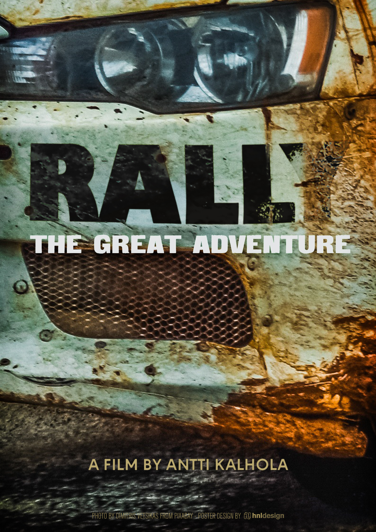
This is a YouTube movie a friend of mine tipped me, about rallying. I grew up in the Group B rallying era, and ever since I was a child, I have been fascinated by dirt/mud/sand/ice racing’s raw power and prowess. Of course, this movie immediately rekindled that sensation, and as this is clearly an independent film and a labor of love, I immediately set to work to create a fitting poster for it. After searching for a good source image, I settled on this great shot by Dimitris Vetsikas from Pixabay. I already had an idea in my head, which was to ‘write’ the word ‘RALLY’ onto a car, and apply wear and mud to it. The rest of the design flowed from that idea.
Dunkirk
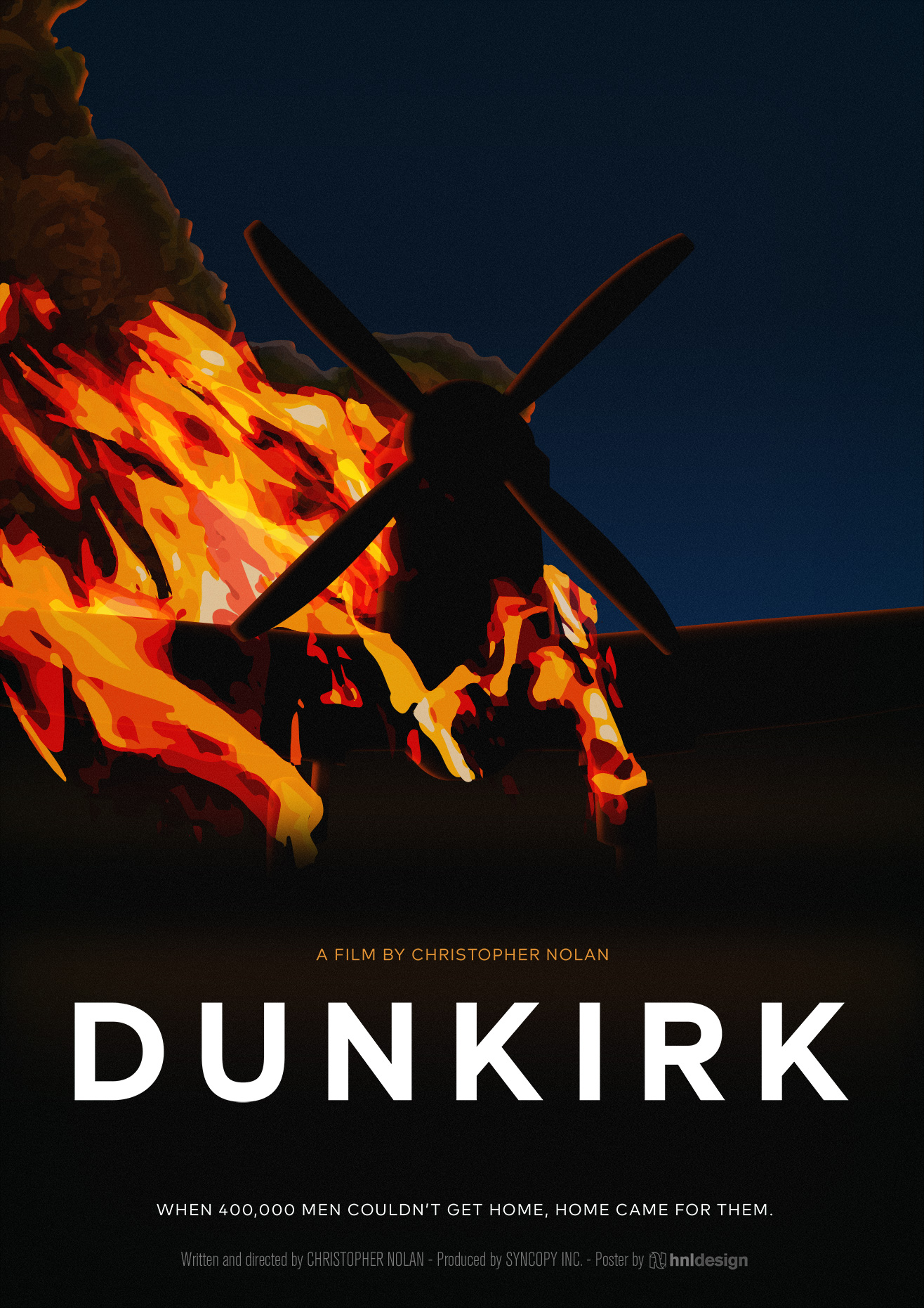
When I think of the movie Dunkirk, the image that springs to mind almost immediately is the burning Spitfire, an iconic shot that I decided to use to work on. I drew a Spitfire from the front, heavily stylized, and started adding fire. This time, I decided to go for a dark look, as opposed to the more white-based previous designs. I decided to match the font close to the original posters, to keep a connection with the familiar design of the franchise.
Apocalypse Now
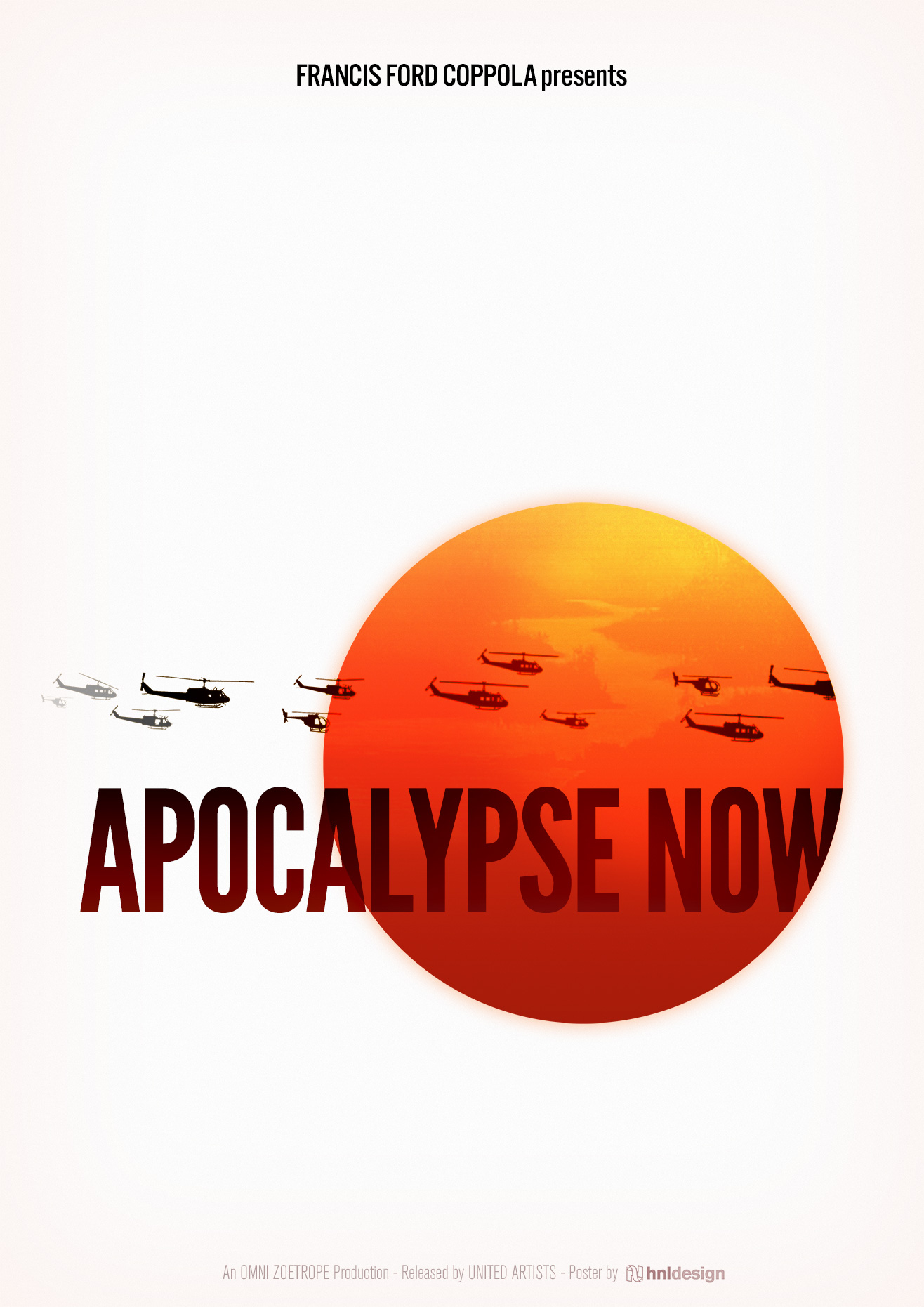
For Apocalypse Now, I took the basic, and already very established and familiar ‘squadron of huey’s’ flying along the sunset, but instead used the sunset effects (not the sun itself) as a sun image, capturing both the sun and sunset vista in one circular shape – providing me with space to keep the poster very abstract. The Huey’s were drawn from several military profile drawings.
After experimenting with the original, very specific, and recognizable title font, I decided against using it, and chose a super-condensed sans serif font, emphasizing the monumental state of the movie.
Tora! Tora! Tora!
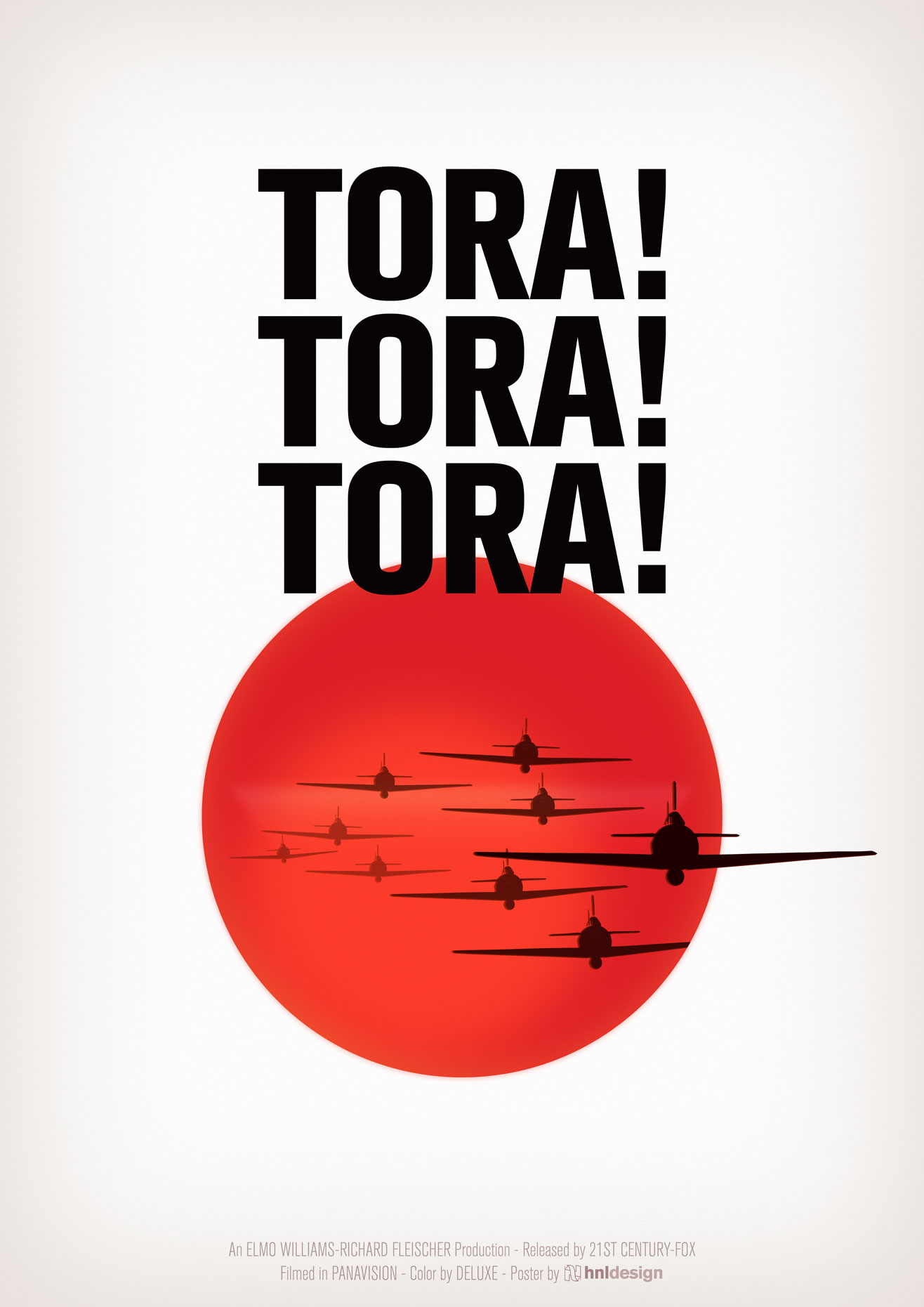
I wanted to keep it as simple as possible. After consideration, I found the Japanese flag to work best, as opposed to the flag of the rising sun. The usual bland red dot was ‘livened up’ with some gradients, attempting to create the illusion of a rising or setting sun. It can be interpreted both ways: rising would symbolize the dawn of the attack while the sun’s setting would depict Japan’s ultimate fate.
I added the silhouette (drawn from a wartime army recognition guide) of the infamous Mitsubishi A6M “Zero”, which partook in the attack on Pearl Harbor, which is what the movie depicts. One plane ‘pops out’ of the Japanese flag, giving the work some added depth.
The Longest Day
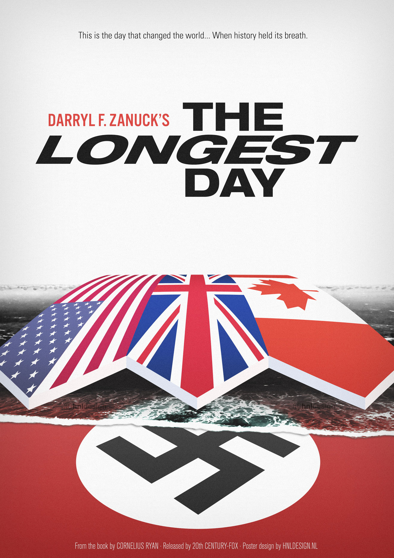
This is the first attempt, for The Longest Day (1962). I took the basic aspects of the invasion (Axis and Allied forces involved) and combined them with the iconic scene in the movie, where the invasion forces appear on the horizon. I particularly like how the wave turned out, washing over the flag of Nazi Germany like the Allied forces ultimately overcame the Axis forces.
I tried to keep the title recognizable while attempting to bring its typography to the modern age.
No Responses